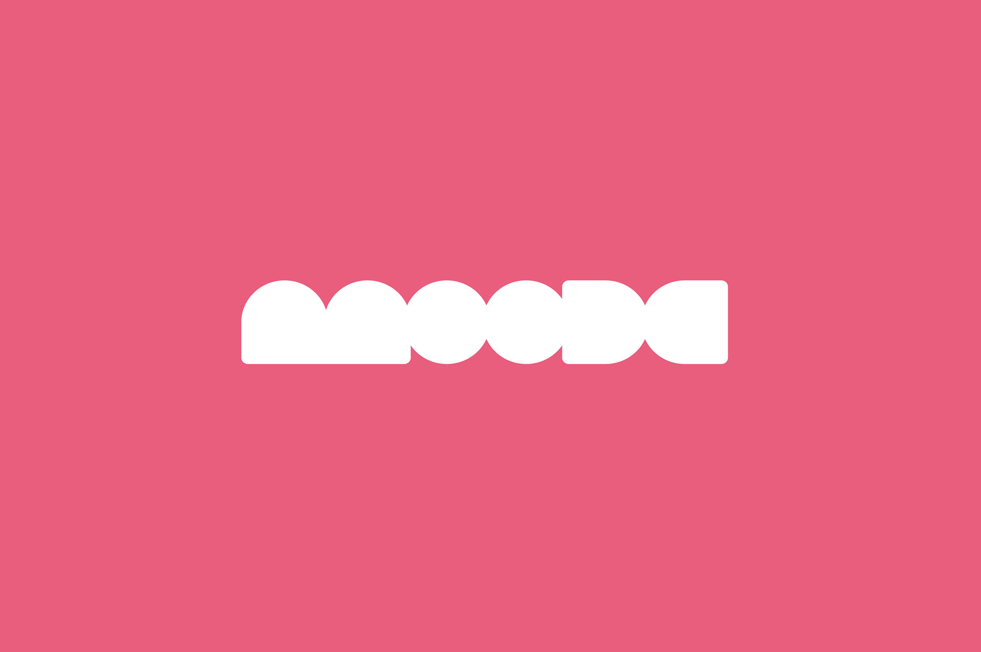
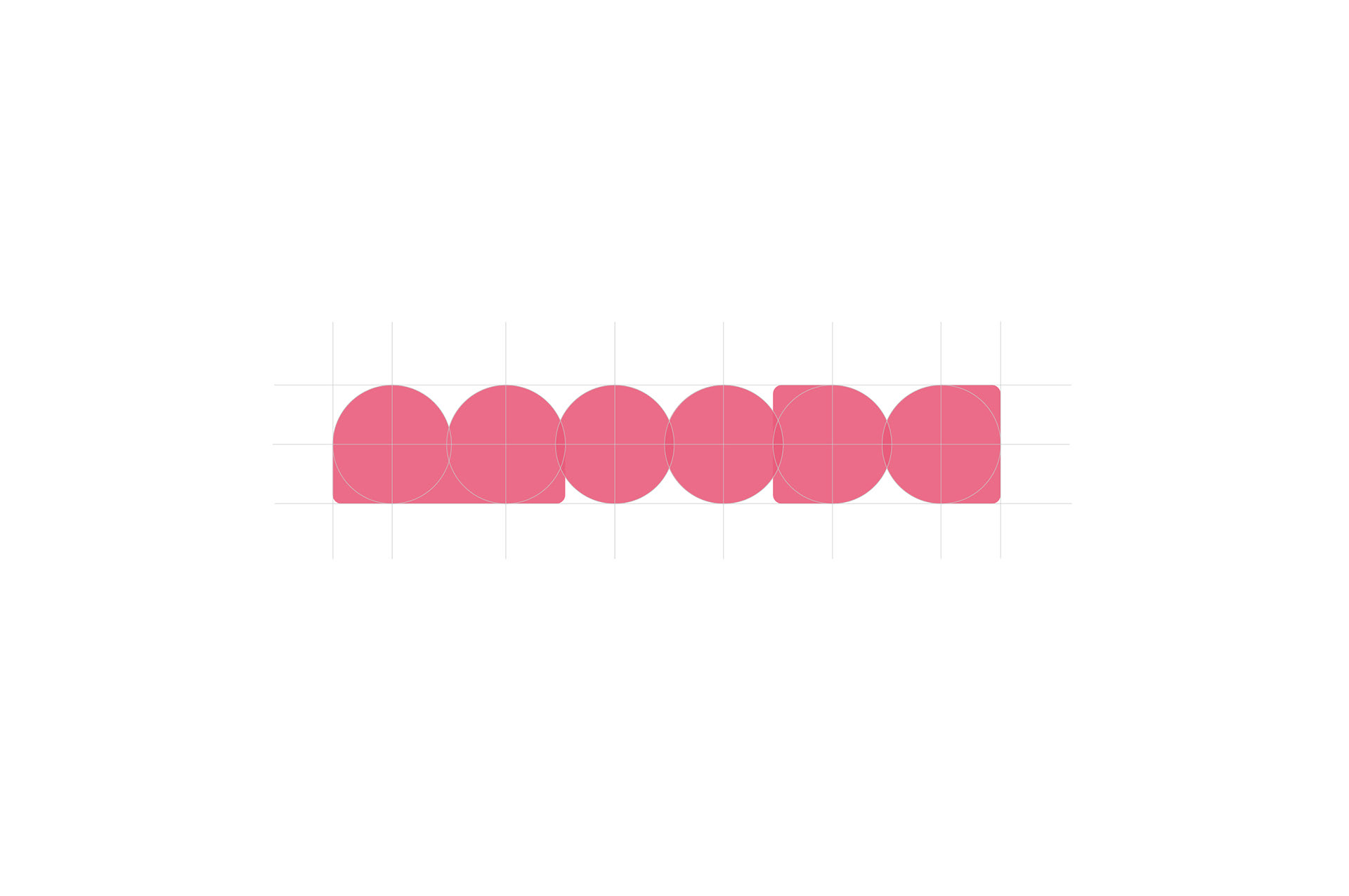
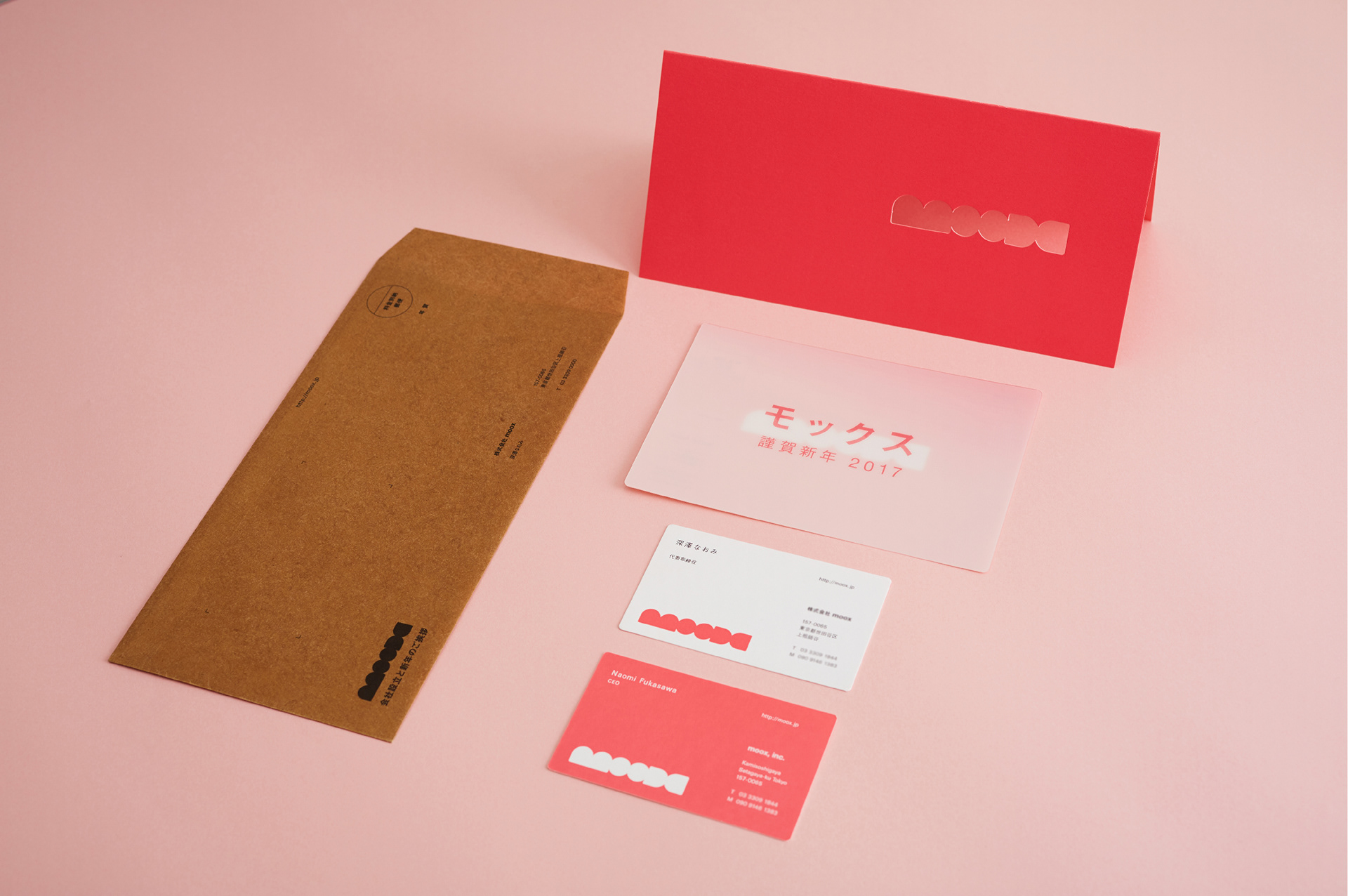
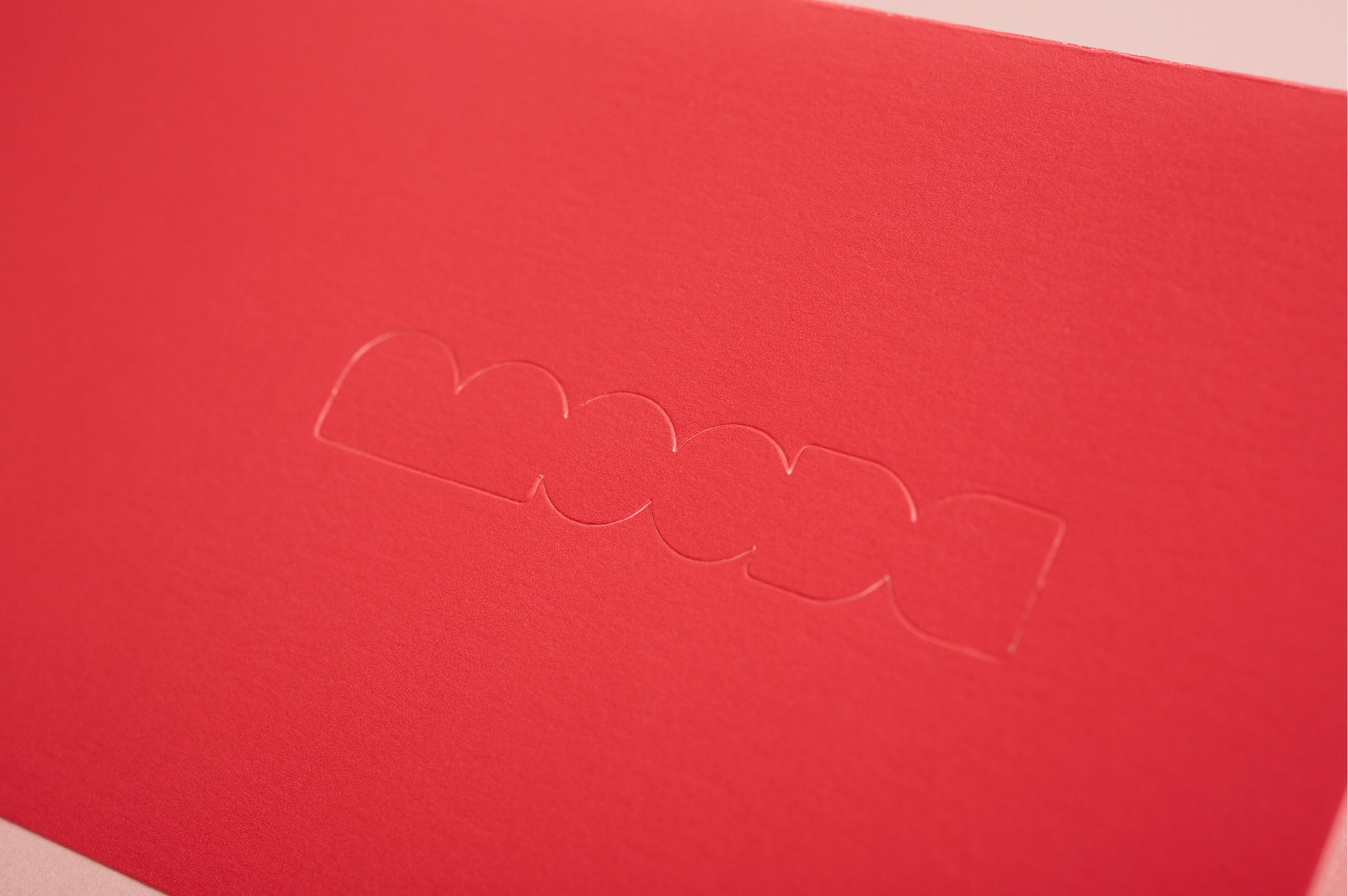
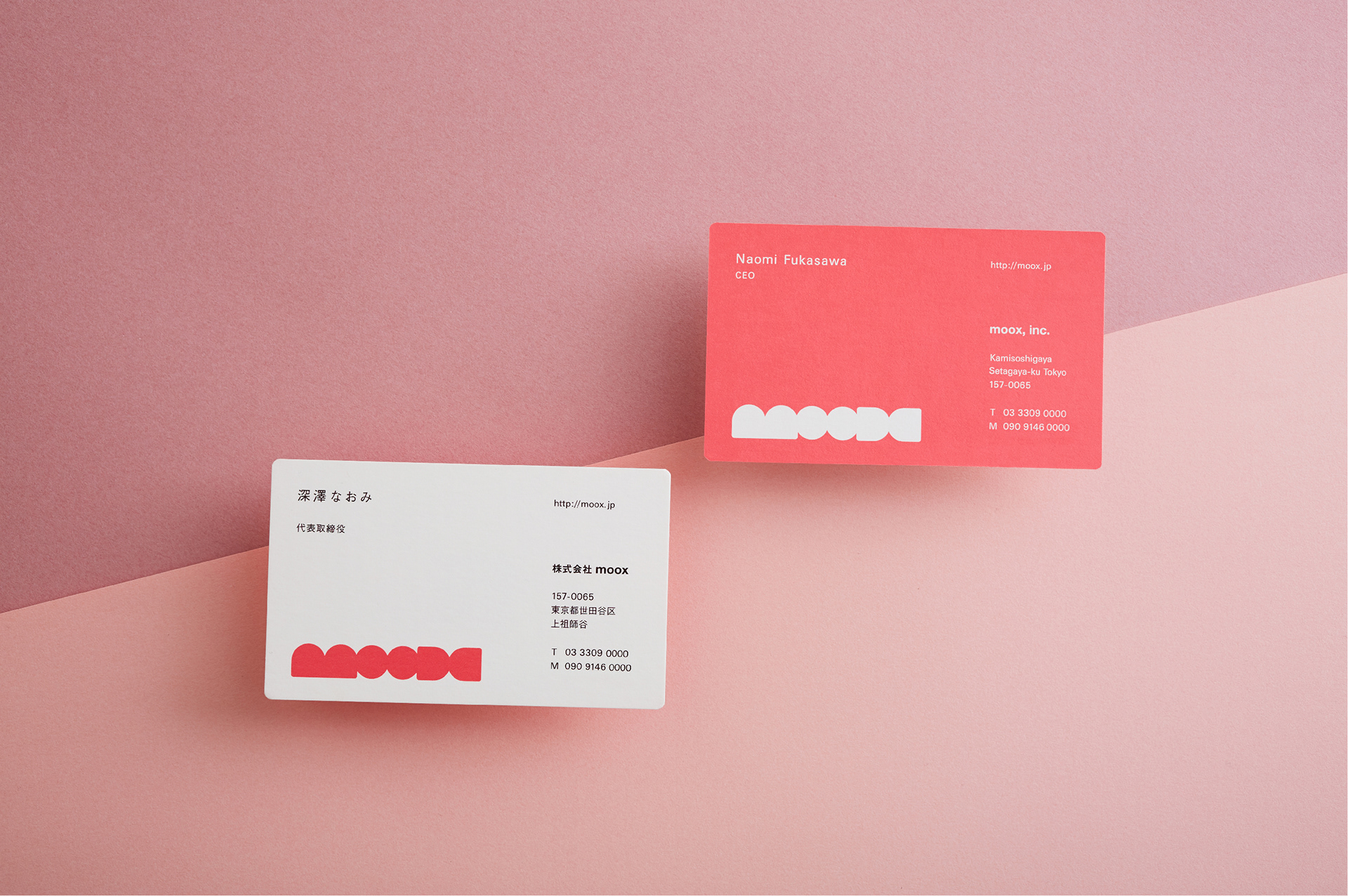
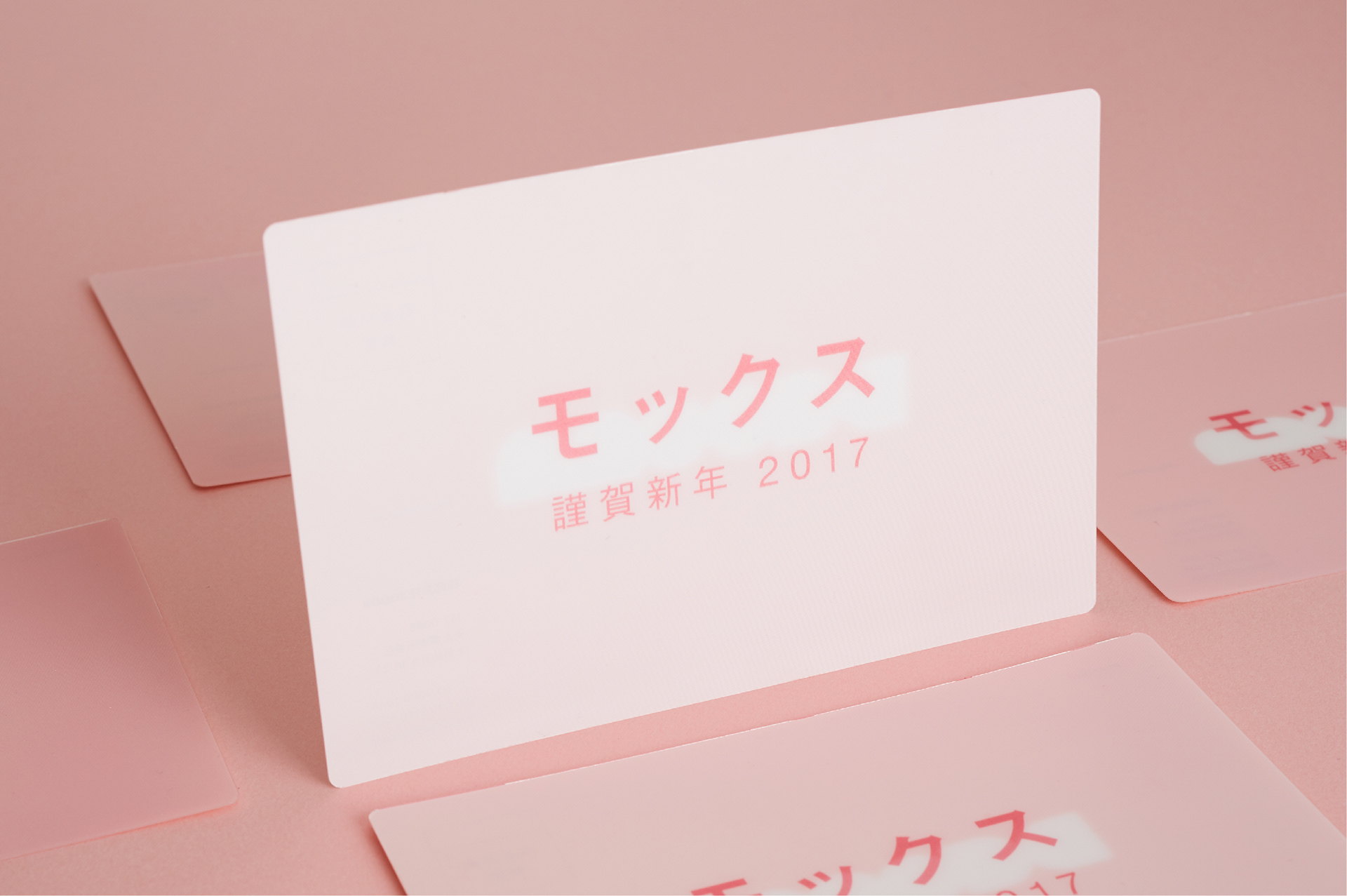
株式会社mooxは、課題を紐解き、アイデアを結ぶ総合広告代理店です。ブランドイメージを作り上げるにあたり、ロゴ・名刺・DM・WEBなどを担当しました。ロゴは丸の幾何学模様をベースにしています。丸はアイデア一つ一つを意味し、mooxがアイデアを結びつけお客様の課題を解決していくことをイメージしています。色は、代表の好きなカラーをベースに、活力溢れる色合いに調整して表現しています。
moox, inc. - a general advertising agency based in Tokyo, Japan.
In this project we were tasked to create their brand image. We designed logo, business card, DM, and website.
The key concept of the logo is “ solves the task of their customers by connecting their ideas. ”
Circle means ideas, and reasons why letters are so close are connection of ideas and with their customers. We chose pink for their brand color, which CEO’s favorite color but we didn’t used the simple pink. We adjusted the color to match their personalities “full of energy.”


CL:moox, inc.
Production:シカタ株式会社
Art Direction & Design:北本 浩一郎
Photographer:竹林 省悟
CL:moox, inc.
Production:CICATA, Inc.
Art Direction & Design:Koichiro Kitamoto
Photographer:Shogo Takebayashi